
Here is an amazing section that will help you to show a Product collection, Heading title and you can choose the grid, carousel, or masonry layout for this section.
1. Featured collection
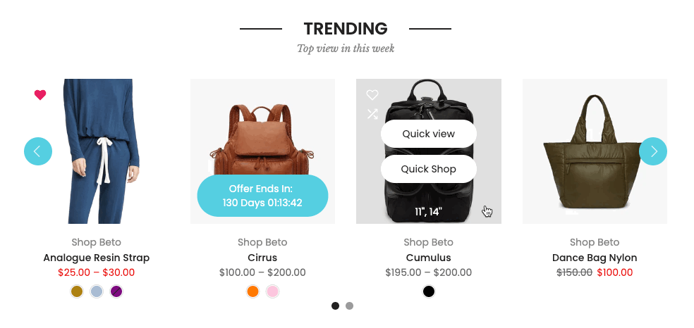
It is usually located on Homepage. However, Shopify 2.0 allows you to add the Featured Collection section to any pages that you wanna use.
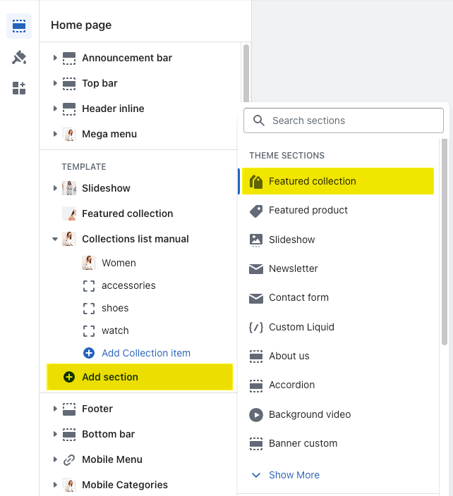
Steps: In the theme editor (Customize) > Add section > Featured Collection > Save.
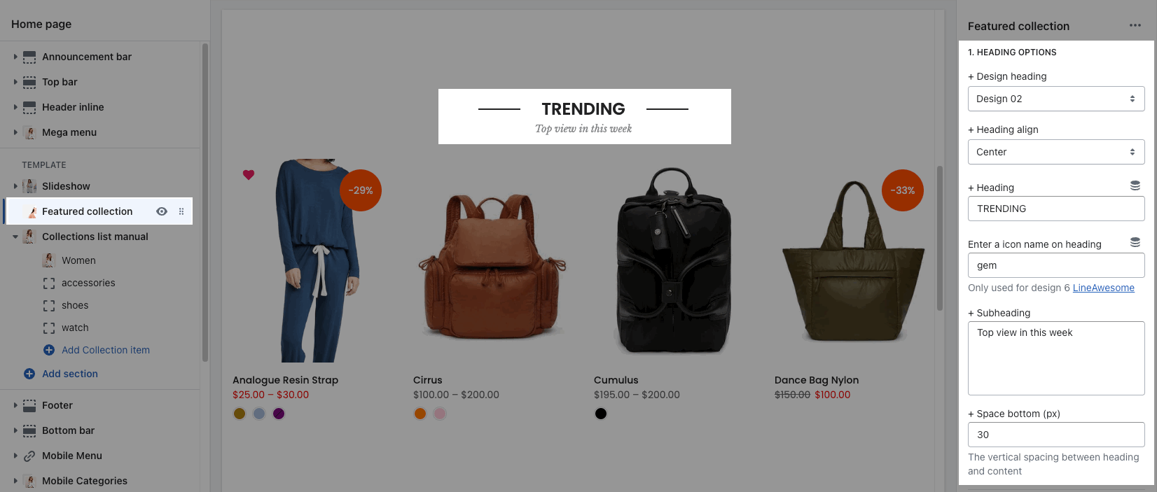
HEADING OPTIONS
You can change Heading design, Heading align, Subheading and Space bottom.
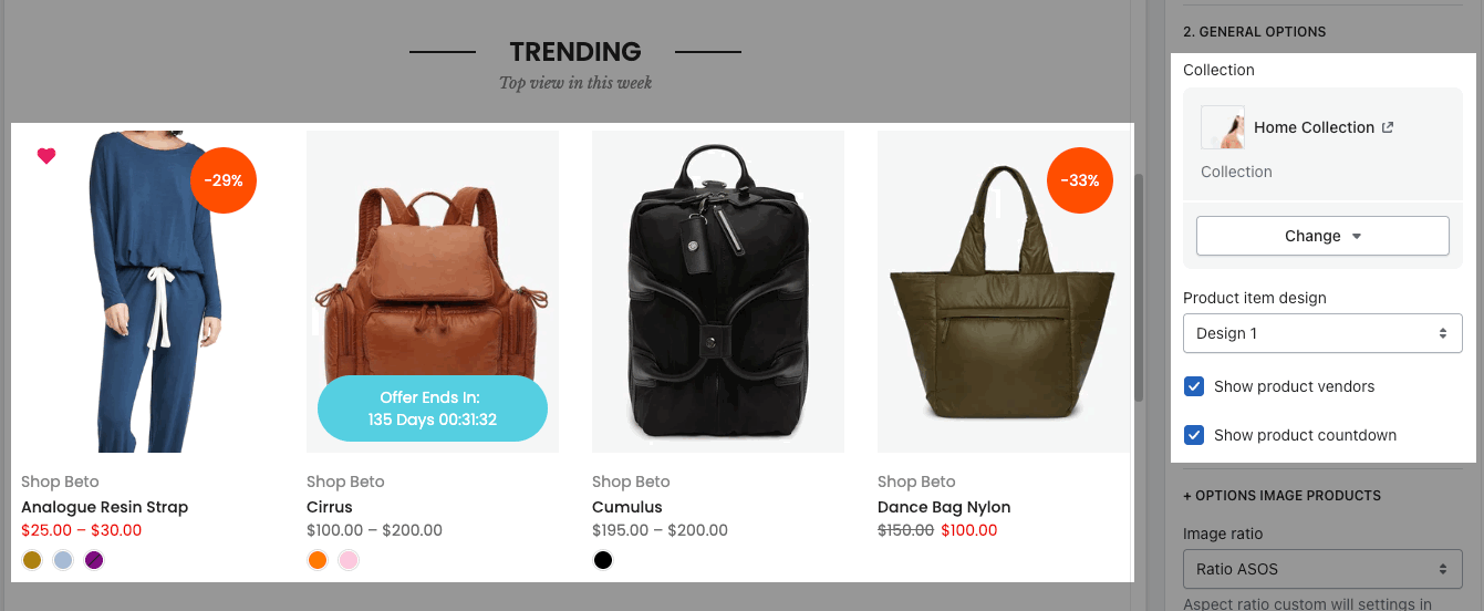
GENERAL OPTIONS
-
Collection: Select a collection that you want to show in this section.
-
Product item design: you can choose the design for product items and Show product vendors, Show product countdown.
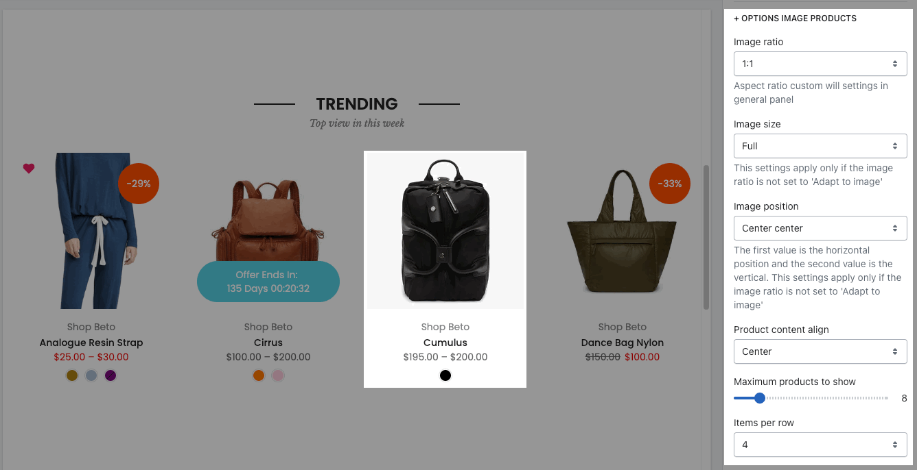
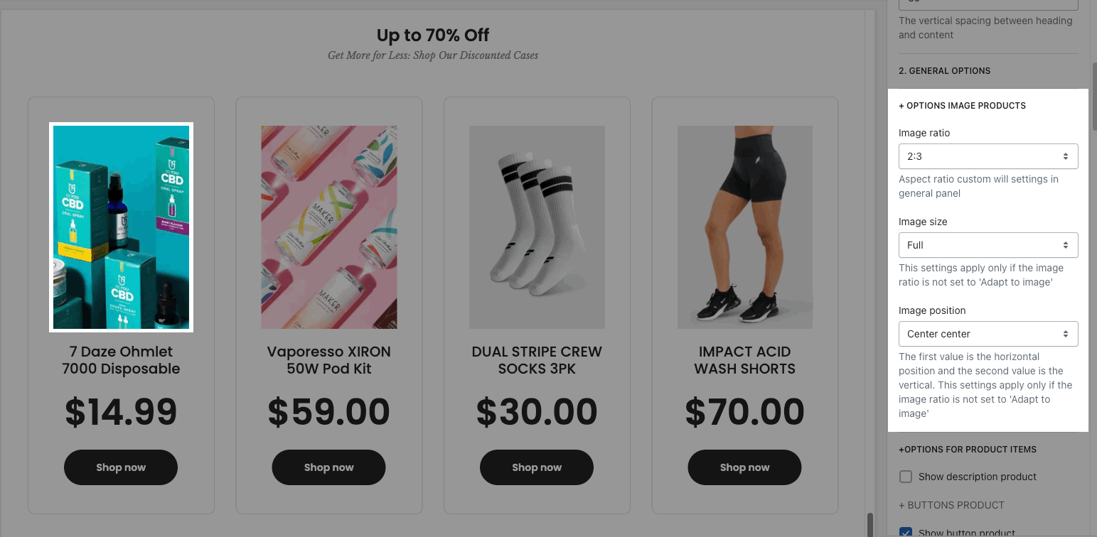
OPTIONS IMAGE PRODUCTS
-
you can change Image ratio, Image size, Image position.
-
Product content align: set text align for text content of product.
-
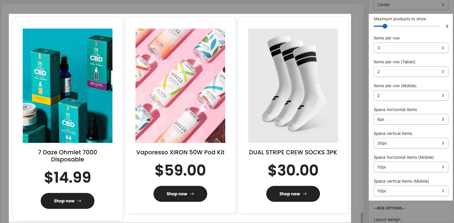
Maximum products to show, Items per row and Space between items (horizontal and vertical)
BOX OPTIONS
-
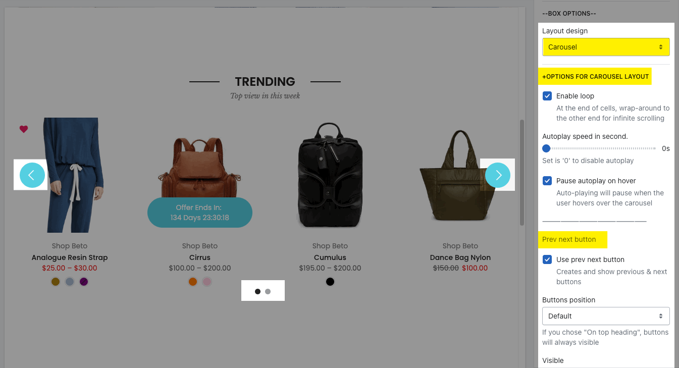
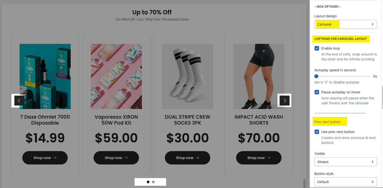
Layout design: You can choose Grid, Carousel or Masonry layout.
OPTIONS FOR CAROUSEL LAYOUT
-
you can Enable loop, config Autoplay speed
-
Prev next buttons: enable them and change Visible, Button style, Button color, Button size, etc...
-
Page dots: enable and change some styles
OPTIONS FOR GRID OR MASONRY LAYOUT
-
Pagination: You can choose among Load more button, View all button, or None. You also have some options to config for this button
Please follow check this video below for details:
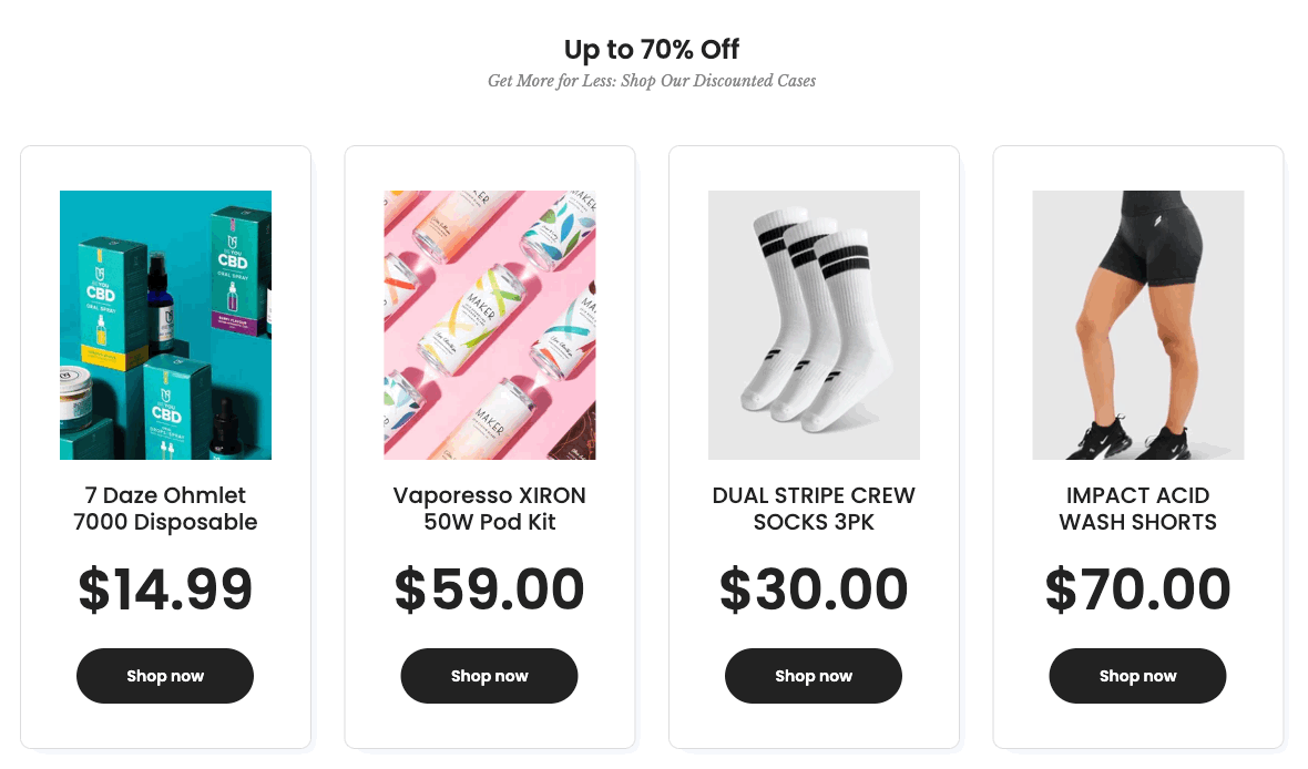
2. Featured collection 2
Steps: In the theme editor (Customize) > Add section > Featured collection 2 > Save.
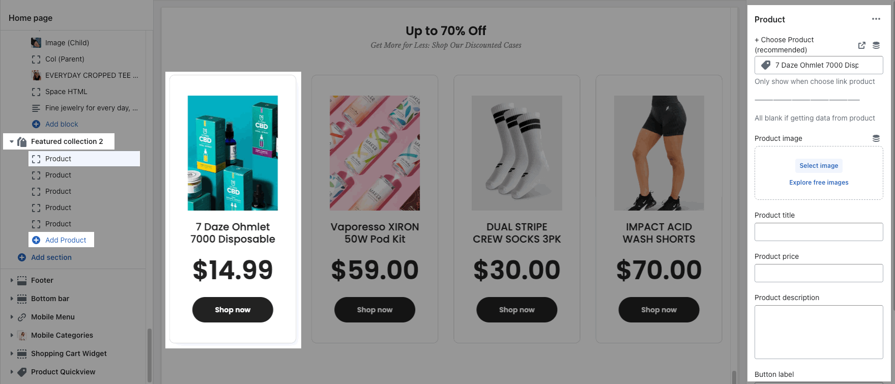
2.1. Product item
Click on Featured collection 2 > ADD PRODUCT. You can choose a Product from Shopify or enter an image, title, description, price, link to build a product.
2. Featured collection 2 options
HEADING OPTIONS:
-
You can enter the Heading and Subheading, choose the design for the heading, also can choose text align: center.

OPTIONS IMAGE PRODUCTS:
-
you can change Image ratio, Image size, Image position.
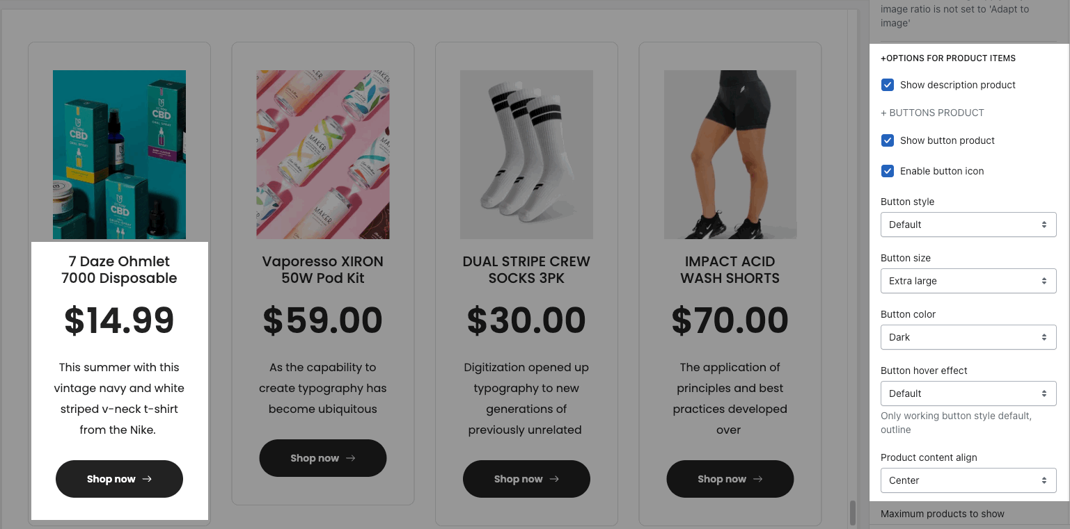
OPTIONS FOR PRODUCT ITEMS:
-
Show description product
-
BUTTONS PRODUCT: change Button style, size, color, hover effect
-
Product content align: set text align for text content of product.
-
Maximum products to show, Items per row and Space between items (horizontal and vertical)
BOX OPTIONS:
-
Layout design: You can choose Grid, Carousel or Masonry layout.
OPTIONS FOR CAROUSEL LAYOUT: you can Enable loop, config Autoplay speed, adjust the style for Prev next buttons and Page dots


